Blog

  • Section 3 – Social Media

    Based on your research, what social media platforms do you think they should target as it relates to your defined audiences (2), content and getting our message across for our specific campaign? Please justify your answer. (2 x 5 marks = 10 marks)

    AUDIENCE A: early adopter tech professional

    recommended platforms; X and Facebook

    X….

    X, formerly known as Twitter is a strong platform for audience A: (affluent male early adopter tech professionals who are 27 to 35 years old) because it matches the way that they consume tech information: casually, quickly and in real time. This audience is always keeping up with daily AI news, tech launches, debates about new products and the opinions of niche tech influencers. Since this particular audience already sees themselves as someone who is knowledgable about tech and enjoys staying privy to emerging technology, X is a great place to position WIZPR as a legit part of future AI interaction.

    X is a platform that would be especially useful for:

    • launch announcements
    • News jacking AI stories that relate back to our message
    • Real time conversations with founders, tech, influencers, and early adopters
    • Product updates for both investors and potential buyers

    The message we want to convey through this campaign is that the WZPR ring  is not just another gadget. It is to be positioned as a useful tool, and the next interface for AI. This kind of message will communicate well on X because people there are interested and talking about new AI tools and productivity in the future of technology. It also helps the brand feel knowledgeable, current, niche and involved in the tech community.

    Facebook….

    Facebook will also be a valuable platform for this audience. Even though it may seem a bit less niche than X, Facebook still has extremely strong usage among millennials and higher income web users which aligns perfectly with our target audience. 

    Facebook 

    A huge advantage of using Facebook is that it is a community based platform. Users on Facebook often join groups centred around a shared interest; in this case, technology, AI and productivity tools. This would create an environment where authentic conversations, recommendations and pure validation play role, and influencing purchase decisions.

    This is important for audience a because they:

    • Look for genuine reviews, and real world cases to make judgements about products ( especially ones that are newly released)
    • Engage in tech discussions and are involved with the community
    • Trust peer opinions, and early adopter feedback more than an ad from a brand

    Facebook works well for this campaign in particular because it supports:

    • Visual heavy posts with short captions
    • Storytelling content
    • posts that are Shareable/repostable
    • Comment driven engagement

    In the case of audience A, Facebook will be used to present relatable every day issues, such as messy notes, disorganized schedules, and missed meeting/appointments, then it will position the WZPR ring as the solution. Because this audience responds positively to testimonials and authenticity, Facebook gives the brand a space to blend  human, community based message with educational content.

    JUSTIFICATION…

    using X in Facebook to connect to audience A will be effective for this campaign because it gives the brand both credibility, increased trust, and broad awareness. X assists in guiding the brand towards real AI and tech conversations where early adopters are active, meanwhile, Facebook helps get our core message to more people quickly and efficiently through relatable, engaging posts that build excitement and move the user towards the bottom of the funnel 

    AUDIENCE B: The privacy conscious professional 

    recommended platforms: LinkedIn and Insta

    LinkedIn…

    LinkedIn is the best platform for this audience because they’re demographic is primarily older professionals ( 45-55 years old) with busy schedules, a strong desire for increased productivity, and a need for trust before going through with a purchase. They are likely already using LinkedIn to read business content, network with others, and keep up with new tools and innovations.

    LinkedIn would be a useful platform in emphasizing

    • The rings ability to provide privacy and discretion
    • Productivity benefit benefits
    • Signals of trust, such as founders, awards, and other backing
    • Business use example cases

    This audience is not likely to be persuaded by hype alone, they want proof that the product is reliable, discreet, and will be useful in their everyday life. LinkedIn allows the brand to position itself as a serious, legit product rather than just trendy tech piece of junk. The messaging here will focus on private AI access, scheduling support, smart, home integration, and organization for busy professionals.

    Instagram…

    Instagram is another effective social media platform for audience B because it is a visuals first platform that helps us demonstrate how the WZPR ring can be integrated into a viewer’s lifestyle, and it’s beneficial features.

    Instagram is useful for:

    • Founder Q&A’s
    • Reaching out to the brand directly through comments or DM
    • Building trust through visual
    • User generated or community based engagement (ex. comment section, story reposts)
    • Carousels explaining discrete product functions and other features
    • Storytelling through carousels
    • Short form video content
    • Visuals-first content with short captions

    This is important because one of audience B’s largest concern is whether AI is able to be used discreetly and professionally in their own daily life. Instagram will give whisper an opportunity to communicate our message visually that the product is useful, subtle, and stylish without feeling like an intrusive ad.

    JUSTIFICATION

    Linkedin and instagram are the best combination in reaching audience b for this product because they balance visual product demonstration, and professional trust. LinkedIn will support logic based decision making and trust while Instagram supports education about features, user generated content, and direct engagement with the brand, which feels approachable and modern.

    Based on the topics discussed in class as they relate to social media content and planning, please create two (2) Facebook posts for your revised Audience “A”:
    a. Create a post promoting the product.
    b. Create an engaging post that drives awareness and action (e.g., participation, sharing, excitement for the product, signing up for the waitlist).
    For each post, please outline your planning criteria and justify your goal, reasoning, and key elements. Don’t forget to include the destination for each post and your reasoning and goals for each. (10 x 2 = 20 marks)

    2 Facebook posts for audience “A” – early adopter tech professionals

    Audience A – 27-35 year old tech engineer living in an urban environment with a busy schedule and struggles with organization in his daily life

    Post A:  Product Promotion Post

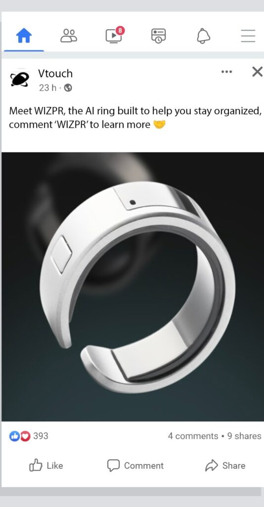
    Description of visuals: Facebook feed static post with a high-quality photo of the WIZPR ring with lots of negative space.

    Goal: this post goal is to promote the WIZPR ring by introducing it as a solution to a relatable problem that our audience has: disorganization in their fast paced work life

    Post Copy (Caption): 

    Meet WIZPR – the AI ring built for professionals.

    miss fewer details, organize faster, and keep your day moving without pulling out your phone.

    Would you use this?

    Criteria

    • short caption (under 100 words)
    • Messaging that highlights benefits (organization, and productivity)
    • Question based call to action to drive comments without seeming pushy
    • Visuals-first content (image of the ring)
    • Professional yet relatable tone

    Goal

    The goal of this Facebook post is to promote the product encourage engagement and spark initial interest from our target audience

    Justification 

    This post follows the best practices of Facebook content by keeping the caption short and easy to consume (KISS). Shorter posts perform better here because users scroll quickly and are more inclined to read if the caption is concise and the visuals do most of the work sending the message

    The phrase “built for professionals” was used in this post because it immediately differentiates WIZPR from its competitor smart rings (aura, samsung ring) which focus mainly on fitness. This positioning is crucial because one of WIZPR’s strongest selling points is that it is designed for scheduling, notes, and productivity.

    The messaging focuses on the product’s benefits rather than its technical features; it highlights, efficiency, workflow implementation, and organization- which are all issues for audience A

    The call to action at the end of the caption- “ would you use this?” was deliberately written to invite the audience to comment and interact with the post without seeming too generic or annoying. According to our research, questions can increase engagement by approximately 23% making this ineffective method and generating comments, shares, and discussion.

    Lastly, Facebook is a community based platform where users are able to engage with each other through opinions, shared experiences, and conversations. By asking a question at the end of the caption, the post invites users to participate in a discussion rather than scroll past the content, which helps increase visibility and increase awareness of the message organically.

    Key elements…

    • Awareness stage positioning
    • Community based interactions
    • Benefit driven messaging
    • Short and concise high performing caption
    • Question based CTA to boost engagement

    MOCK UP….
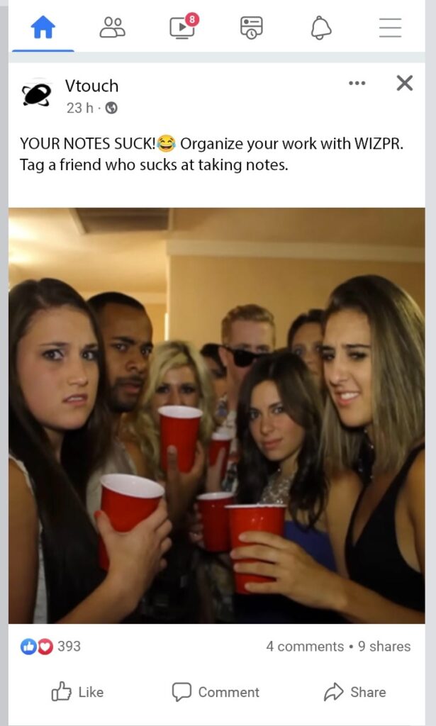
    Post B: Awareness & Engagement Post 

    Description: static Facebook feed post using a meme style image with a short, concise caption with a friendly tone.

    Copy/ Caption

    Your notes suck 😂 

    Organize your work with WZPR. 

    Tag a friend who sucks at taking notes.

    Planning Criteria

    • uses a bold hook to disrupt scrolling patterns
    • short copy compared to visuals for optimized Facebook performance
    • Encourages tagging and shares for reach
    • Focuses on relatable frustrations of a disorganized schedule or work notes
    • Humour based approach for higher engagement

    Justification 

    This post is meant to feel more casual and shareable than the previous promotional one. Audience A (early tech adopters)  spends time viewing tech based content on social media, but they also respond to content that feels relatable and entertaining. A funny hook, such as your notes suck, grabs attention instantly because you wouldn’t expect it from a brand. It also connects with a real problem this audience has in their daily life: disorganization.

    A humourous approach makes the product and brand feel much more approachable, while the second line of the caption connects back to the WZPR rings solution. The CTA at the end, encouraging users to tag a friend helps grow our organic reach and builds outside awareness through user to user sharing, which is a key factor in growing a loyal consumer base during a launch campaign.

    This post is also effective because it uses authenticity; rather than sounding overly corporate, polished or robotic, it sounds like something a real person would post. This aligns with our audiences mindset because they prefer peer reviews, authentic branding, and storytelling when they are considering purchasing a product. Our target audience will appreciate that the post feels more like storytelling than selling.

    Key Elements

    • Shareability
    • Awareness stage focused
    • Humour and relatability
    • Strong, eye catching hook
    • CTA that encourages an action

    MOCK UP….
    Based on the topics discussed in class as they relate to social media content and planning, please create two Instagram posts for your revised Audience “B” demographic:
    a. Create a post highlighting specific functions of the product.
    b. Create an interactive post that encourages engagement and participation (e.g., user-generated content, hashtag challenge, community stories).
    For each post, please outline your planning criteria and justify your goal, reasoning, and key elements. Don’t forget to include the destination for each post and your reasoning and goals for each. (10 x 2 = 20 marks)

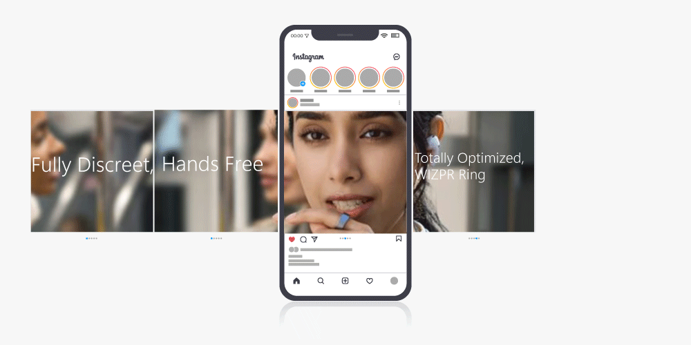
    POST A – Carousel image Text description….

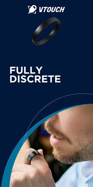
    fully discreet

    Hands-free

    Totally optimized

    WZPR ring

    Caption….

    Are other people listening when you talk to AI? 👂 

    Most AI are not discreet and lack security, but with WIZPR, your conversations are kept completely private. Speak freely, and totally hands-free.

    Comment “WIZPR” to learn more!

    • uses a pain point hook that plays on the fear of being listened to
    • Emoji increases the likelihood of commenting by 33% according to discuss discussions in class (Scott Briscoe, W 12 – create perfect social media post(W26).pdf, slide 14)
    • CTA designed to have engagement and let people learn more about the product

    Justification:

    With carousel format posts having an increased reach, we felt it was logical to create not just any carousel, but a memorable one. The carrousel is designed with fluidity in mind, feeling more like an interactive advertisement rather than a collection of photos. The context of the ad capitalizes on the fear of privacy from the target consumer and creates incentive to learn more.

    Post B – story post

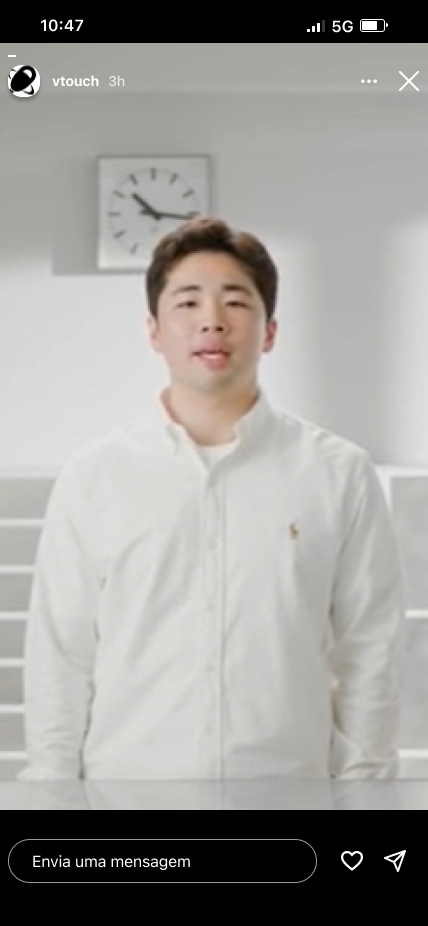
    Description of on screen text – “ ask the founders a question about the WZPR ring⁉️ we will answer as many as we can! 

    visuals – image of the founder, smiling

    • interactive Q&A section that gives the user the ability to get personal questions answered
    • Feels more authentic and community driven

    JUSTIFICATION…

    The story post is designed with live interaction in mind. The Q&A gives users the opportunity to speak directly to the brand which feels authentic and personalized. It drives actions with the goal of creating engagement that builds the authority and reputations of the owners. This aligns with a bigger goal of the campaign, which is to position the WZPR ring as the next interface of AI and not just another gadget.

    MOCK UPS….
    WIZPR believes TikTok will be a crucial platform moving forward. As we did not cover actual video creation in this course, you will not be required to create the actual TikTok videos. Based on the topics discussed in class as they relate to social media content and planning, your group is to create a TikTok video concept and storyboard for each of the audiences. Bonus marks if you create and submit the video. For each post, please outline your planning criteria and justify your goal, reasoning, and key elements. Don’t forget to include the destination for each post and your reasoning and goals for each. (10 x 2 = 20 marks) + 4 bonus marks for submitting videos

    Revised secondary audience A: 45-55 year-old privacy conscious professional 

    *45-50 y/o guy appears on screen sitting in his car, wearing a dress shirt, he is speaking in an urgent, exciting tone*

    “Did you know 1/3rd of Canadians Report Having A Poor Work/Life Balance ?!

    I was at Canada’s Wonderland with my family and my phone was blowing up. Something went down at the office and they needed immediate attention. But these moments are important and I put my family first. 

    So, I bought this WIZPR ring the other day * quickly flashes ring* and it has let me send messages, set deadlines and move meetings around without even having to pull out my phone. I highly recommend this product if you want to be more in the moment but still effective in your professional life, check out the WIZPR Ring in the description.”

    (Story telling time format with trending sound quietly in the background)

    CAPTION: link to WZPR ring #storytime #smartring #ai 

    OUTLINE….

    • opens with the speaker talking to his phone in his car to establish an authentic, natural setting. He has an urgent and excited tone
    • He opens with a statistic that relates to our target audience (references a struggle with work/life balance ) 
    • The man explains how work can interrupt important family time and the importance of being present in the moment
    • Quick flash of the Ring
    • Explains the reasons that the WIZPR ring offers a solution
    • Ends with a genuine recommendation for users to click the link and buy their own as a CTA

    DESTINATION…

    organic TikTok feed/for you page, possibly a sponsored post

    OUR GOAL…

    The goal of this TikTok is to authentically connect with this audience by presenting them with a relatable daily struggle, and using someone who looks like them in a natural setting as the speaker and using a testimonial format. The TikTok video is meant to highlight the rings practicality, and it’s ability to support work/life balance and efficiency in professional life.

    PLANNING CRITERIA……

    • authentic storytelling format in a natural setting (car) from someone who represents our target persona
    • Avoids overwhelming, the viewer and simply presents a relatable problem with the WZPR rings practical functions as a solution
    • Exciting yet slightly urgent tone to grab attention
    • Focuses on real life issues

    JUSTIFICATION….

    This TikTok concept is strong for our specific audiences needs because it closely aligns with their lifestyle and specific pain points. This audience is established and professional, they are not looking for another gadget or something flashy, they want something that is actually practical in their daily life and helps them save time , stay in the moment and help life feel more organized. We know that this is a prevalent issue for our audience.

    By highlighting this tension between work and home life, this TikTok video helps to position the WZPR ring as a meaningful solution rather than just a fad. This combined with the authentic storytime formatting communicates that WZPR is not just about productivity at work, but also gaining control over your personal time and attention.

    The use of a first person testimonial in a casual setting on TikTok feels natural, personal, and easy to watch rather than feeling like a traditional stiff ad.

    KEY ELEMENTS…

    • Discreet and convenient product positioning
    • Testimonial style to show real life use
    • Physical demonstration to show discreet functionality
    • Awareness/consideration stage messaging
    • Relatable storytelling
    • relevant hashtags that will drive organic engagement

    Revised secondary audience B: 27 to 35 year-old early tech adopter

    Younger tech guy struggles to take and organize notes in meetings. Has used notion apps and finds them ineffective. After getting the WIZPR ring he loves how easy it is to take notes and record meetings and then have them all organized for him.

    TIKTOK VIDEO DESCRIPTION….

    *sleek looking 27-34 y/o guy appears on screen sitting in his car, wearing a dress shirt, he is speaking in an urgent, exciting tone*
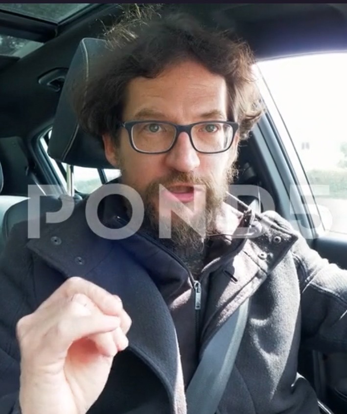
    “YOU SUCK at notes if you haven’t bought a WIZPR Ring yet. *pointing at user* ….

    I was using note taking apps throughout school and meetings but I would get home and realize my notes were just a mess of words. Like what does  “Talk to that guy” even mean? ( screen shot of jumbled notes appears on screen)

    but after I got this guy *puts WIZPR ring up to the camera* Now I can remember everything that was talked about in the meeting and implement it into my workflow. I seriously can’t stop using this thing, click the link and up your note taking game.”

    Caption: link to WIZPR ring #notetakingapps #ai #smartring

    OUTLINE….

    • opens with a bold hook, consistent with our other social posts. “ YOU SUCK at notes if you haven’t bought a WZPR ring yet” 
    • The man explains how working with regular notetaking apps is quite unhelpful and messy
    • Shows a quick screenshot of messy notes
    • Displays the ring on his own finger to show it’s sleek design and then explains how useful it is in his daily life and why
    • Ends with a genuine recommendation for users to click the link and buy their own as a CTA

    DESTINATION…

    organic TikTok feed/for you page, possibly a sponsored post

    OUR GOAL…

    our goal here was to build awareness with our target audience by recognizing a daily struggle that they most likely have (disorganized notes). We wanted to make our message more memorable by highlighting one clear product benefit that will strongly resonate with users.

    PLANNING CRITERIA……

    • Shocking hook in the first few seconds to disrupt scrolling
    • authentic storytelling format in a natural setting (car) from someone who represents our target persona
    • Avoids overwhelming, the viewer and simply presents a relatable problem with a clear benefit that the WZPR ring has: organized notetaking, as a solution
    • Exciting yet slightly urgent tone to grab attention
    • Focuses on real life issues
    • Include a direct CTA which directs users to a product link

    JUSTIFICATION….

    this TikTok ad concept is effective for this specific audience because it directly speaks to one of their biggest frustrations in their busy work life: disorganized notes. Audience B will have only have interest in a tool like this if they can genuinely it use every day for work to save time, improve workflow, and help them feel more organized. By directly addressing poor organization and disorganized notes, the video calls out a pain point that this audience feels.

    The use of a first person testimonial in a casual setting on TikTok feels natural, personal, and easy to watch rather than feeling like a traditional stiff ad. This aligns with audience B because they prefer an authentic opinion coming from someone who has similar issues to them over polished and salesy language.

    This concept also supports the brands general campaign goals. They want to highlight value, educate, and decrease scepticism around a new type of wearable AI, they don’t want it to feel like another gadget/fad. Showing how it helps a real person in their daily life makes the ring feel more tangible and accessible. Instead of making the WZPR ring feel like a weird futuristic gadget that is out of reach, the video presents it as a useful every day tool that seamlessly fits into a professional’s work life.

    KEY ELEMENTS…

    • Shocking, scroll disrupting hook
    • Testimonial style to show real life use
    • Physical demonstration to show sleek look and accessibility
    • Awareness stage messaging
    • Relatable storytelling
    • relevant hashtags that will drive organic engagement

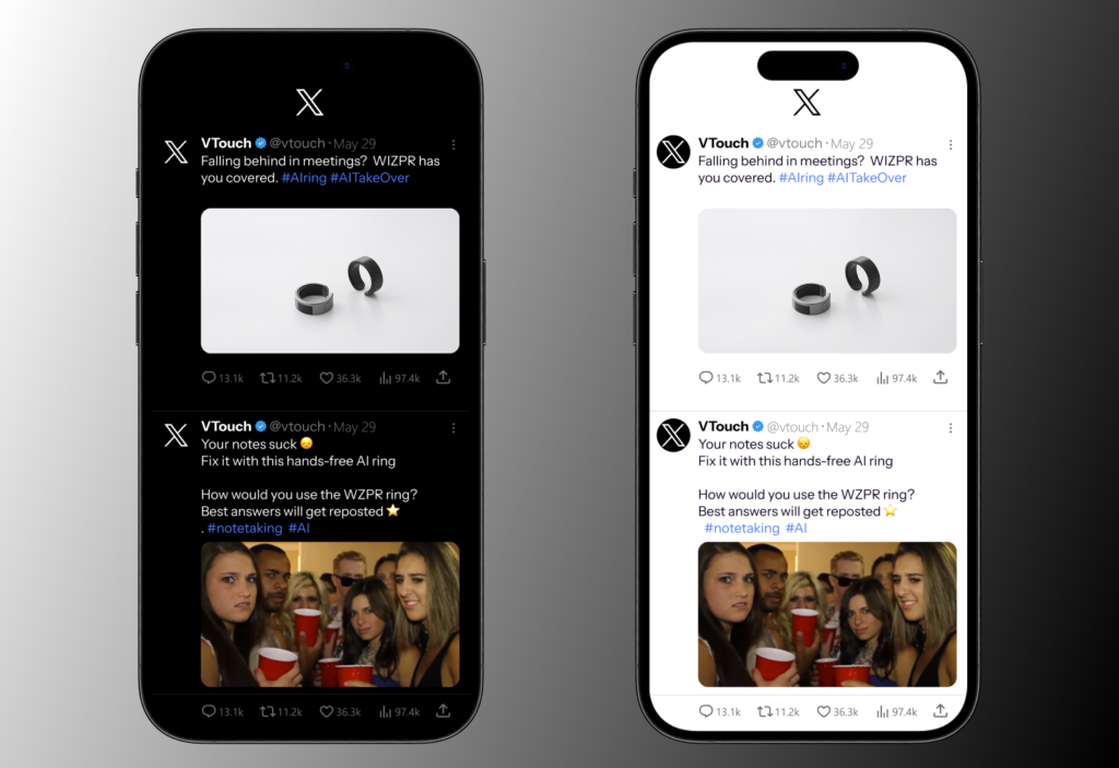
    Please create two tweets (for X) based on the Facebook posts in question #2. Explain what you did differently, outline your planning criteria, and justify your goal, reasoning, and key elements. Don’t forget to include your reasoning and goals for each. (10 x 2 = 20 marks)

    Tweet #1 Copy

    Falling behind in meetings? Missing details at work?

    The WZPR ring helps you instantly capture ideas, set reminders and keep life organized – without even pulling out your phone

    Would you use this?

    link: link here

    What was done differently from Facebook?

    the original Facebook post relies more on engaging visuals, as well as a longer, more descriptive caption, this was changed to fit the more quick and direct content style that the app is known for. This version focuses on short and concise text that clearly delivers a message using as little words as possible while keeping our specific audience engaged.

    The post begins by immediately addressing a common problem in our target audiences daily life at work – feeling disorganized: “falling behind in meetings? Missing small details at work?” this is designed to immediately catch their eye and position our product as a solution to that problem. The question based format was used to improve readability and break The audience’s scrolling pattern.

    The same question based ending was used to wrap up the tweet to encourage engagement in the comment section or even shares/reposts: “would you use this?”. this will be even more effective in driving interaction because of the nature of retweets and reposts on x. 

    We also highlighted a useful benefit of this product for this specific audience in a short body paragraph, which is that it allows them to instantly capture notes without pulling out their phone or loudly talking to Siri: The WZPR ring helps you instantly capture ideas, set reminders and keep life organized – without even pulling out your phone

    Planning criteria…

    audience fit – this post is aimed at our first audience: 27 to 35 year-old tech professional professionals who are male and struggle with organization in their daily work life. The opening hook sentence directly speaks to them by expressing their real life issues, making WZPR‘s content immediately catch their eye.

    Our goal – the main objective here is to gain awareness of the WZPR ring and increased engagement on X. We also want to increased waitlist sign ups. I highlighting WZPR’s ability to seamlessly solve problems in the users daily life, the post encourages interest in the product and interaction with the post.

    Content format – we chose to use a problem-solution format for this post because as mentioned above, a pain point for this audience is that they may consider the WZPR ring just another gadget, to avoid this we want to position the WZPR ring as something that they can actually use in their daily life and to assist them at work. The problem is clearly stated in the first line, followed by a clear explanation of how the ring can help them.

    Messaging strategy – the messaging in this particular post focuses on the ring’s benefits rather than it’s technical features. This was chosen because the technical features would be investigated by the user after they are hooked in by hearing how the ring can help them. Technical features are not usually something that catches the eye off the bat.

    The benefits highlighted include…

    • hands-free convenience
    • Increased productivity
    • Better organization

    Tone and voice for X – The tone on this post is concise and professional, yet relatable. It avoids language that tries to sound to wordy/smart. By not overcompensating in this way. It supports the campaign’s goal of positioning the brand as credible and knowledgable rather than just a fad.

    Call to action – a dual call to action was used for this post:

    “ would you use this?” —-> encourages the audience to engage with the post through comments, replies, or repost

    waitlist : link —-> drives them to sign up for the waitlist, which will increase key KPI‘s  (conversion rates)

     Adjustment for Platform

    The post was adjusted and optimized to perform well on X by….

    • Leading with a strong hook
    • Breaking content into short lines for a readability
    • Using plain language in short, concise sentences
    • Encouraging users to interact with the post to increase awareness of this campaign

    Tweet #2 Copy

    Your notes suck 😞

    Fix it with this hands-free AI ring

    Instantly set reminders, capture, notes, and keep your life in check – all without missing a beat

    How would you use the WZPR ring?

    Best answers will get reposted ⭐️ 

    Waitlist: link here 

    What was done differently from Facebook?

    While our Facebook post relied on a meme style picture to catch the users eye and encourage users to tag their friends, this version is changed to focus on more reply/retweet based engagement, which is far more effective on X. The post was also adjusted to better suit the text- first nature of X content.

    The eye-catching, humour based hook: “your notes suck” was kept to keep consistency with the original post. The call to action line was changed from Tag friend who’s notes suck to how would you use the WZPR ring? This was done to directly ask the audience a question and encourage them to respond to the post and think about how they could use it in their daily life.

    Planning criteria

    our goal… our primary goal, as supported by the hook and question at the end is to drive engagement (replies/retweet/comments). The secondary goal is to highlight the benefits of the WZPR ring, particularly in daily productivity and organization.

    audience fit… this post was designed to target a 27 to 35 year-old male tech professional who is an early adopter and follows niche tech accounts on Twitter to keep up with AI news and new products. In their daily life, they struggle with managing multiple tasks and organizing their workflow. Our opening statement is meant to highlight a relatable issue with their life (feeling like their notes/organization is messy) which makes the content following it relevant and engaging

    Messaging strategy… rather than focussing on technical features off the bat, this post emphasizes real life benefits that the audience can gain from using the ring.…

    • hands-free convenience
    • Increased productivity
    • Better organization
    • Setting reminders as soon as they come to the brain

    Content format… this post relies heavily on a strong hook first, designed to disrupt scrolling patterns. This is followed by a paragraph offering the WZPR ring as the solution to their daily problem by highlighting its benefits. To finish it off, we directly ask the audience a question to invite deeper thinking and engagement.

    Tone and voice… to help the brand feel more like a real, approachable person, we chose a casual, relatable and slightly humourous tone. This works for our target audience because they prefer content that reads less corporate/stiff and more like a one-on-one conversation between knowledgable peers.

    Call to action… the CTA : “how would you use the WZPR ring?” Is designed to encourage replies. We chose to ask a question because a statistic we learned in class said that it is much more effective than simply telling the audience what to do. The question we are asking also feels genuine and not desperate or pushy.

    It is also designed to increase engagement through offering an incentive – “ best answers will be reposted” 

    we also added a link to the waitlist to create curiosity and anticipation for the release. This also creates a measurable conversion rate for this post and aligns with the brands goal of getting more people to sign up for the waitlist. 

    Overall, this multilevel CTA supports both increased product awareness through replies/repost and increased lead generation.

    Adjustment for a platform… this post was adjusted and optimized for X by:

    • leading with a strong hook, that pokes fun at the audience to capture attention and establish a more casual tone.
    • Writing short and concise content that uses as little words as possible for scanability
    • Breaking content into short, digestible lines for readability
    • Encouraging X- specific replies to grow organic reach and brand awareness

    justification of key elements

    Bold hook… immediately catches the users eye and make them stop scrolling

    Highlighting a daily pain point… connects deeper with our audience and make them consider the WZPR as a real solution

    Benefit driven writing… clearly communicates what the WZPR ring actually does and how it can solve their problems

    Incentive… telling users that the best replies will be reposted sparks more motivation in them because they want to “beat” others.

    Concise/broken down structure…. Aligns with how people consume content on X. It also follows our many class discussions about the way people read content on the web – they scan they do not read.

    Reply- based CTA… increases organic exposure to the post and encourages genuine conversations about the WZPR ring.

    MOCKUPS….
  • Section 4 – Blog Post and Rich Media Ads

    1. Please create an introductory blog post designed for your revised (Primary Audience ). (15 marks) 

    a. This post should: 

    i. Introduce the WIZPR Ring 

    ii. Explain how it benefits the audience.

    iii. Highlight the impact of the product and how its features will impact/help the Audience. 

    iv. Encourage readers to engage with the campaign—whether through social media, signing up for the waitlist/purchase, or sharing the message. 

    v. Include clear calls to action (CTAs) to drive further engagement. 

    Blog Copy: 

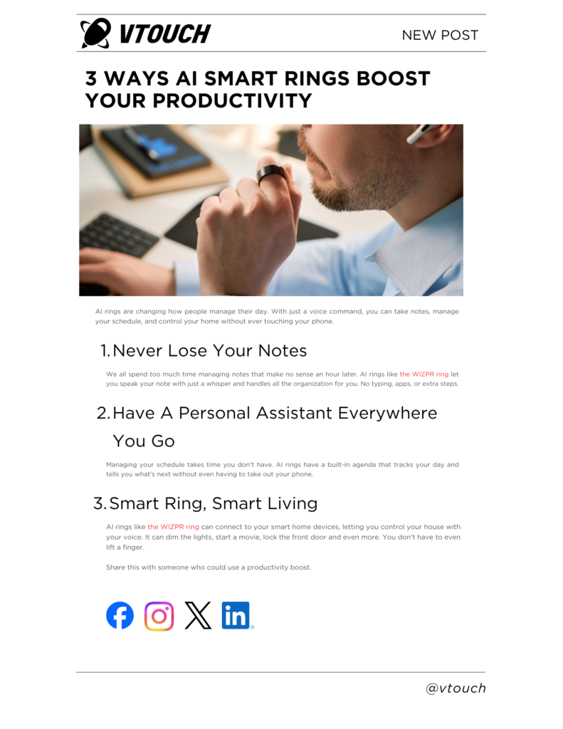
    3 Ways AI Smart Rings Boost Your Productivity

    AI rings are changing how people manage their day. With just a voice command, you can take notes, manage your schedule, and control your home without ever touching your phone.

    1. Never Lose Your Notes

    We all spend too much time managing notes that make no sense an hour later. AI rings like the WIZPR ring let you speak your note with just a whisper and handles all the organization for you. No typing  or extra steps.

    1. Have A Personal Assistant Everywhere You Go

    Managing your schedule takes time you don’t have. AI rings have a built-in agenda that tracks your day and tells you what’s next without even having to take out your phone.

    1. Smart Ring, Smart Living

    AI rings like the WIZPR ring can connect to your smart home devices, letting you control your house with your voice. It can dim the lights, start a movie, lock the front door and even more. You don’t even have to lift a finger.

    Share this with someone who could use a productivity boost.

    Blog sample: 

    You will be marked on the content and your answers to the questions below. 

    1. Please provide your content and explain your planning thought process. 

    For the blog, we are building content to attract awareness, as it follows through the top-of-the funnel. Our goal is to not sell the WIZPR ring directly, in a sales pitch, but rather subliminally, outline WIZPR in an authentic tone. The blog follows a structure by using plain language, F-pattern, headlines, headers, and a clear CTA. Our plan was to give WIZPR an introduction into the AI ring market, and outline how it differs from the rest that sets it apart. We also aim to establish WIZPR as a thought leader in the market and an authority on AI Rings. When approaching our target audience we recognize the major concerns revolve around organization and time management so by highlighting the key benefits of AI rings for people and suggesting to them WIZPR ring is the best ring to get these benefits they feel they are learning and not just being sold to and that the choice to buy an AI ring was their idea, they just so happened to choose WIZPR.

    1. How it meets our objectives. 

    The blog meets our objectives of bringing awareness of WIZPR using top of funnel informational content. With the CTA being focused on sharing and spreading the post we have designed it to increase attention on the article which drives increased traffic to the blog and increases our blogs DA (Domain Authority). By providing an opinion on a real conversation we are more likely to drive organic traffic to the site as the headline and content are heavily based on. It introduces the concepts of AI rings, then transitions into the WIZPR ring as a link into the new WIZPR website.  The blog  highlights the impact of the product and how the features will impact the audience 

    1. Your calls to action and justifications. 

    The CTA is driving users to share and engage with the content by encouraging sharing with friends. The reason for this CTA is that we are trying to build top of funnel awareness and therefore spreading the blog builds more attention and creates further reach. It’s also designed for the consumer to do some work when it comes to deciding who may need the product itself, basically free advertising. It turns organic searches into free referral links from social media by capitalizing on user engagement.

    1. Please provide in-depth justifications as they relate to elements discussed in class. 

    The headline uses gain to have the user want to read more. By writing the article as an opportunity to find out how AI rings can boost their productivity they will see it as a net positive to find out. For the target audience who is actively seeking productivity tips and tricks this is the best way to build awareness and get the user to engage with the content itself. The headline uses an odd number and a statical fact that would make them open the headline, since numbers are eye-candy. 

    The content is easily scannable and reads clearly. Immediately telling the reader what they gain from reading the content and what they could possibly lose if they don’t. We highlighted three key benefits that would relate to the target audience which are advancements in note taking, personal assistance, and how the smart ring integrates with their smart technology. The content is designed to not feel like promotional material rather an informational top of funnel piece that positions WIZPR as an authority in the AI ring market.

    2. To facilitate our ad network advertising, we have to provide the content for three digital display ads (banners). You will be required to write the content for a “four frame” banner in multiple sizes to encourage people to learn more about the WIZPR Ring. You will be required to develop a visual storyboard for each banner. Please separate each banner on its own page with the following: (15 marks) 

    Display Ad Sizes 

    300 X 600160 X 600468 X 60

    Please include: 

    a. Banner size. 

    b. Content presented in separate frames. 

    c. The goal of the banner. 

    d. Reasoning and justification for each banner as it relates to topics covered in class. 

    e. In-depth explanation of your planning process and reasoning. Destination plan. 

    2. a. Banner size. 

    Banner 1: 

    300 X 600 – Half Page 

    b. Content presented in separate frames. 

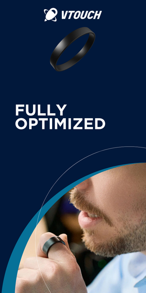
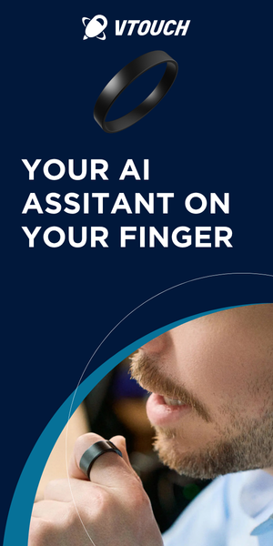
     Storyboard: Focuses on the WZPR ring being fully discrete and optimized

    c. The goal of the banner. 

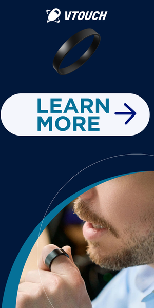
    The goal of the banner is to outline the WIZPR’s ring benefits of the ring discreetness. The banner gives a snippet of what the ring is about and builds interest. It builds interest to the target audience and uses a very small word count to keep it simple. It builds curiosity and intrigue and encourages the audience to learn more. It highlights the benefit of the AI assistant on your finger that will help you manage your job with discretion and optimization.

    d. Reasoning and justification for each banner as it relates to topics covered in class. 

    The font used for the banner is gotham. “Gotham is the most used font used on display ads.” (Scott Briscoe, W13 – B- Banners in 2026 (W26). pdf, Slide 36). With the font, it helps with reliability and is modern. The banner uses dark text against a light background, for example the CTA. The CTA button is a white background and the text is in blue to stand out against. The display ad follows the outline of a banner, with the logo, image, content and the CTA. 

    e. In-depth explanation of your planning process and reasoning. Destination plan. 

    Our planning process was to prioritize the WIZPR ring’s discreetness. Each of the frames outlines the benefits of the product. The first frame focuses on the ring being fully discrete. The second frame mentions how the ring is optimized. The third frame text is “Your AI Assistant on Your Finger”, which demonstrates that the WIZPR ring is primarily focused on carrying messages through AI integration. The last frame is the call-to-action, to learn more, for those to click onto the button of the display ad. 

    a. Banner size. 

    Banner 2: 

    160 X 600 

    b. Content presented in separate frames. 

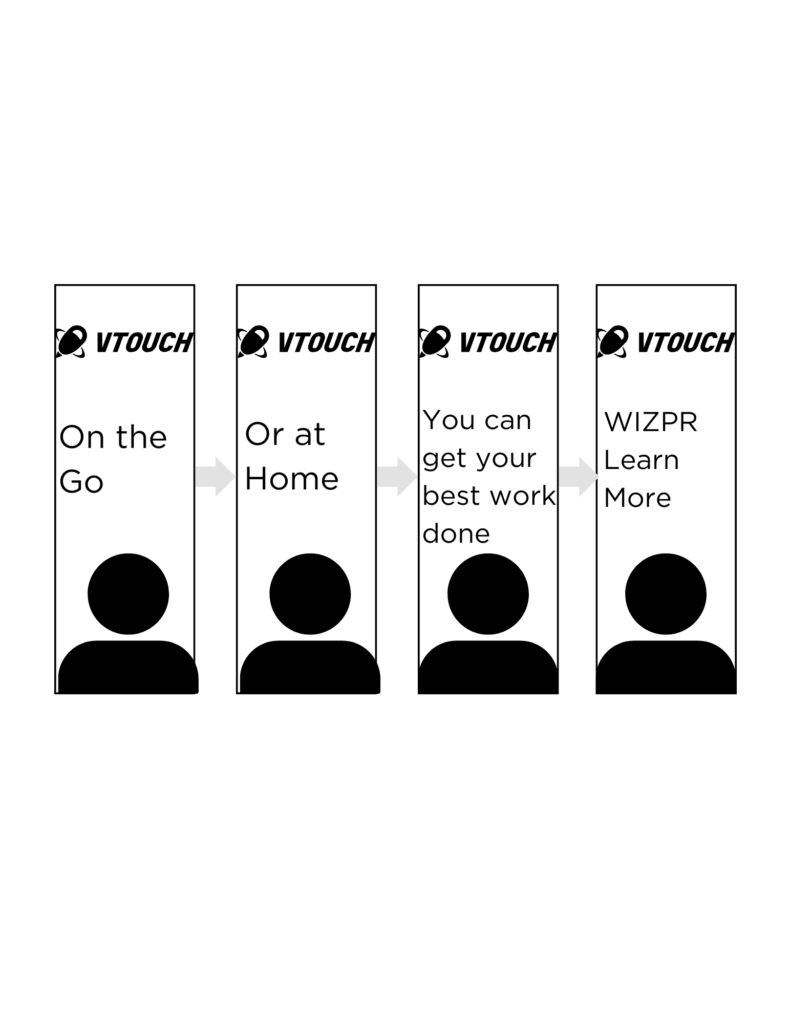
    Storyboard: focuses on how it benefits those who are busy 

    c. The goal of the banner. 

    The goal of the banner is convenience. We wanted to showcase that the ring is functional and you can bring it anywhere with you, especially during busy times. WIZPR fits into your everyday life and the goal of the banner helps encourage people to take the action and learn more about the ring. The banner promotes how you can take the ring and speak into any environment.  It showcases that the woman is using the ring on public transportation. Each frame shows the usage of the ring and how it helps you be more productive. As a result, the user is led into the CTA. 

    d. Reasoning and justification for each banner as it relates to topics covered in class. 

    Each frame uses a minimal amount of  7 words or less to capture their attention. This content helps  those skim through information quickly, so the message is delivered clearly and it is concise. The first frame starts with “On the Go”, which demonstrates someone who is busy and needs something quick. It targets those who are also commuting far distances, and need a way to get work done in a proficient manner. The second frame expands from, “On the Go” into “Or at home”. This frame showcases that you can work anywhere based on their lifestyles, no matter where they are. The third frame outlines how, “You Can Get Your Best Work Done”. With that point given,  the rings are determined to have your work done with the best results. The last banner is the CTA, which gives the audience a direction to go to after they see the display ad. 

    e. In-depth explanation of your planning process and reasoning. Destination plan. 

    The plan of the banner was to interest the audience by having a different message on each frame. Each frame focuses on prioritizing the benefits over the features. With this banner ad it begins with introducing how someone can be in a rush or no matter where they are, their best work can be done with the WIZPR ring which delivers value to the audience. From learning what the ring can do for you, will attract the audience into discovering how or what else, can this ring can help you benefit from. Each frame flows into a direction, where we want the audience to follow thoroughly. As a result, the CTA is a landing page of the product specifications. 

    a. Banner size. 

    Banner 3: 

    486 X 60 

    b. Content presented in separate frames. 

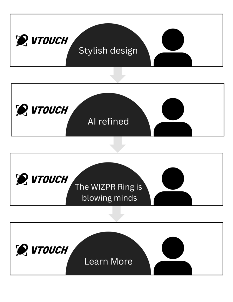
    Storyboard: more than a gadget but also a luxury must have 

    c. The goal of the banner. 

    The goal of the banner is outlining that the WIZPR ring is a fashion statement and it is more than a gadget. The banner captures how there are different benefits that the WIZPR ring has. Each of the frames guides the audience from awareness into an interest, and with the CTA will lead them into the landing page. The banner builds curiosity gaps with why the WIZPR ring is blowing minds and makes the audience peak their interest. The overall goal is to persuade the audience that the WIZPR ring can be both stylish and uses AI. 

    d. Reasoning and justification for each banner as it relates to topics covered in class. 

    The first frame emphasizes that the WIZPR ring can be a fashion statement with its stylish design. The second frame builds interest to the audience by stating that the ring itself is “AI refined”. With the third frame, creates a desire for a need for the audience. From stating that the ring is “blowing minds” builds an emotional appeal of excitement. The last frame has an animation of an arrow key directing to the CTA, to learn more about the specifications of the product.  Each content of the frame is short as it has 2 seconds of attention and each content is 6 words or less, which brings in their attention quickly. 

    e. In-depth explanation of your planning process and reasoning. Destination plan. 

    The banner uses a combination of benefits of it being a fashion statement, innovation and how it builds excitement. Each frame is planned to direct the audience into a direction from a stylish design, AI refined, the WIZPR ring is blowing minds, then into learning more.

  • Section 2 – Website and landing page

    Website – Part A (Theory & Structure)

    1. Explain the difference between a brand website and a landing page in a pre-retail tech launch. (8marks)

    The main differences between a brand website and a landing page are that one is meant to target all areas of the customer journey, and the other is designed for conversion. Firstly, a brand website is made to build trust and inform the consumer before the product is widely available. The goal of the site is to educate the users on the technology, its features, benefits and the brand story. This includes pages like about us, Q&As and a blog for users to explore everything they need to know about the product and brand. This helps people answer questions like whether the product is real or not, or how it works. Overall, having a brand website for a pre-retail tech launch is important for building trust to lead them to that end goal to lead to the bottom of the sales funnel. The landing page is designed for driving campaign traffic, for example, social media ads and email marketing, to encourage conversation. It focuses on one clear goal to drive the users to visit the website to learn more and pre-order the product. This page is very simple, as it doesn’t have any navigation and instead just focuses on the key information. The content of what people immediately want to know, like what it is and what it does. Overall, the goal is to encourage conversation and create an urgency to want to purchase. For a pre-retail tech launch, this matters because consumers are unfamiliar with the product and what it actually is, so first, they need to be educated through the website. When it comes to marketing campaigns like social media ads, they need a place to land to be converted into wanting to learn more and make a purchase, being the landing page. 

    2. Provide four (4) strategic structural differences and justify them deeply. (12 marks)

    The first strategic structured difference in the navigation structure. A brand website, it features a full navigation at the top of each page. This consists of multiple pages, like about us, blog, contact and more, based on what the brand is communicating to its audience. The landing page has little or no navigation and is only one page of content for the user to scroll through. Websites are designed for the user to be able to deeply explore and discover everything to know about your brand and the product you’re selling. This helps people build trust in your brand because the more useful information you can give to the user, the more trust gained. This is especially important for new tech, as there will be a lot of uncertainty and skepticism about what is being sold. On the other hand, the landing page doesn’t have any navigation. Its job is to keep users’ attention and provide the most important information to lead them to the end of the sales funnel. 

    The next structural difference lies in the depth of content and overall structure. A brand website features more long from detailed content compared to a landing page that just gets the point across. They both serve different purposes for the consumer, and where they are on their journey, therefore, the length of content matters. Websites are made for educational and understanding purposes, and the users will spend more time exploring content. This is why you’re able to go more in-depth because people will likely be reading at a slower pace. With a new tech product, explaining how it works and reassuring their safety is crucial information to elaborate on for your website. As for the landing page, users already have some awareness from the ads about the product. The content is a lot simpler and only focuses on the important information that they will want to consume. Additionally, it’s important to know that users have a short attention span, whether they’re on a website or a landing page. This is why having a clear structure to follow and useful content will help with success, since we know people will be scanning. 

    The third structural difference is their role in the consumer’s journey. Each plays a different role in which part of the sales funnel (journey) they are sitting in. For the brand website, the consumer is at the awareness and consideration stage, where they are trying to decide if they should take action. For a pre-retail tech launch, users are unfamiliar with the product, since it’s so new in the market. They will need time to understand how the product works before actually taking the action of purchasing or pre-ordering. The website is a platform where they can answer questions and gain trust in the brand as a whole. Now, looking at the landing page, there at the decision and action stage of the funnel. Users are already somewhat familiar with the product from seeing ads on social media, and now have our attention. The landing page has a purpose to convert their interest into a full action compared to the website, which is more for gaining awareness and informing. This is important because there are different stages that the consumer is at, which require a different structure. 

    The last structural difference is in the call to action (CTA). On a brand website, multiple CTAs are being used throughout, like “Learn More”, “Contact Us”, “Explore Blog” and many more. The landing page will only have one CTA, usually being “Pre-Order Now” or “Buy Now”.  Websites serve users who have different intentions because one may be researching and the other may be comparing products. It’s important to identify that everyone’s needs are different when it comes to a website, which is why we need different CTA cues. A landing page is designed only for one action, usually to purchase the product. Just like mentioned before, the users are already very interested in the product, and the main job of the page is to convert them into a buyer. One thing that you can do is on the landing page respect the CTA, but not too much so that it seems forced. This helps reinforce that goal and works as a reminder to the consumer to take action. It’s important for a pre-launch because the overall goal is to gain awareness and capture early adopters. This is why having strong CTAs will help lead you to more success. 

    Website – Part B (Execution)

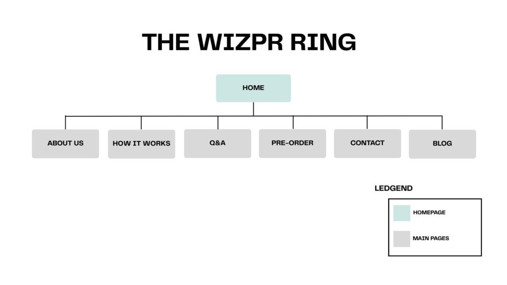
    a) A sitemap illustrating the various site pages.

    b) A complete page for each page of the website, inclusive of the website content.

    c) A homepage mockup including the main site navigation.

    Tasks:

    1. Provide a general overview of the website including the page titles as well as a brief overview & intent for each page. Based on your research and knowledge covered in ADV 421 (as well as included in this project), provide in- depth reasoning as to why you structured the site in this manner and why you intend to create the specific content. (10 marks)

    This website was designed to introduce the WIZPR Ring as an all-new hands-free AI smart ring. The ring is currently in its pre-ratil tech launch, meaning that the goal is to educate and build trust with potential users. The site includes the following pages: Home, About Us, How It Works, Q&A, Pre-Order, Contact, and Blog. 

    Homepage

    The homepage introduces WIZPR to users as an AI smart ring, highlighting its main benefits and features. The page uses strong visuals and simple messaging to quickly communicate what the ring is and its values. The page content is designed using the F-Pattern since we are aware of the way that users will be consuming content, by scanning. The homepage also has a strong CTA to guide users deeper into exploring the rest of the site, so they can pre-order the product now. Overall, the homepage intends to capture attention and move users across the site. 

    About Us Page 

    The next page tells people about the brand (Vtouch) and its purpose and goal. Here you can find information on how Vtouch began to build trust with users. On this page, you can also find a video from the official Vtouch YouTube channel where the founders explain the ring. Additionally, the page also features awards that WIZPR has won and the brand’s partnerships. This builds trust and credibility, which makes users feel more confident that the brand exists. 

    How It Works

    The How It Works page explains how the product works and the key features that make it unique in the market. This page helps the product feel more real and trusted with its step-by-step guide of how the ring works and how you can integrate it into your daily routine. This allows users to easily understand what WIZPR truly is and what makes the technology so unique. 

    Q&A

    The Q&A page is designed to help answer users’ common questions about the WIZPR Ring. This is an important page for a pre-launch tech product because it is a way for people to interact with the brand and learn more. It most importantly helps answer anyone’s speculation and any uncertainty they might have around the product before they make any decisions. Its overall goal is to build trust and support the users’ decision-making, which is where they are sitting in the sales funnel, encouraging them to take action. 

    Pre-order 

    The pre-order shop page is designed to drive conversions. The page answers more of the consumers’ questions, such as what the color options are and the sizes available, through a sizing chart. It also does a great job in giving the users a sense of urgency to pre-order, which is being done through adding scarcity in the written content. For example, “be the first to experience the new AI-powered smart ring”. Lastly, at the bottom of the page, there’s a strong CTA to give them one final push to place their pre-order. 

    Blog

    The blog is used for educational and informational content directly related to users’ questions and concerns around the technology. This page includes content on the tech industry, updates and current cases. The world of AI is such a huge part of our daily life, so having available content related to it can also help with SEO ranking. With new technology its common for users to have a lot of uncertainty about the product, like how they could actually integrate it into their workflow. 

    Contact

    The contact page allows users to easily find information to reach out to a WIZPR team member. It features a simple contact form to be filled out for the user to receive updates on the product’s launch. Additionally, this is the page where you can find the key contact information, like phone, email, and location, to get in touch with a representative from the WIZPR team at Vtouch. This helps build trust through transparency by showing that the brand is real and can offer support to customers. 

    This website structure helps users become more aware of what the WIZPR Ring can do and how they can integrate the product into their daily lives. As discussed in ADV421, the content should be organized and fully support the users’ journey wherever they may be in the sales funnel. Based on the needs and behaviours of the target audience, they are more research-driven; therefore, this structure was designed to answer any questions they may have. With it being a new tech product, we understand that there will be lots of speculation around the product’s launch, so being able to build trust was key. It is set up to guide users through their journey by starting with awareness, then leading to conversion by highlighting benefits and features early on. Additionally, the content focuses on addressing the audience’s key pain points, such as skepticism about the AI technology, safety concerns, and a desire for product efficiency. The content is designed to be highly informational through pages such as the live Q&A and How It Works that provide users with answers to any question they may have about the product. Overall, the structure of the site and the content were designed intentionally to educate and build trust with users on how they could integrate WIZPR into their daily lives. 

    2. Provide the content for each page. Ensure that each page includes the various content elements and structure as discussed in class. For each page, provide in-depth reasoning for your approach, goals, the content and the desired results. Make sure you address the concepts we discussed in class. (20 marks)

    Homepage

    H1: Private Conversations With the Mind of AI

    Section 1:

    What is the WIZPR Ring?

    The new face of AI intelligence

    Meet WIZPR ring, the next generation of hands-free AI intelligence. WIZPR ring allows you to interact with AI technology with just your natural voice, no matter where you are or what you’re doing. Simply speak into your WIZPR ring, and your personal assistant will help you stay organized throughout your busy day. 

    Price displayed: $139.99 USD

    Section 2: 

    Benefits of WIZPR

    Explore what makes our ring unique and how you could use it in your daily routine

    Hands-free Convenience

    Access your AI assistant, wherever you may be, whether you’re working or on the go.

    Privacy You Can Trust

    WIZPR can capture your conversation without anyone else hearing. 

    Seamless Compatibility 

    Easily connects with your phone through the WIZPR app and smart home devices. 

    Accuracy

    Even in a noisy environment, your AI assistant will be able to work whenever you need it. 

    All-day Endurance

    WIZPR has a long-lasting battery that ensures your assistant will be ready for you throughout the day.  

    Organization

    You’re able to manage meetings, set reminders and take notes in real time. No need to pull out a secondary. 

    Section 3: 

    A Smarter Investment in AI

    Other smart rings on the market are focused on fitness tracking, expensive, and are only compatible with certain devices. WIZPR is different because it is built with productivity in mind. Here at WIZPR, we utilize AI intelligence for everyday use that offers more hands-free convenience than any other smart ring. 

    CTA: Pre-Order Now

    Reasoning 

    The Homepage is designed to introduce the product and capture users’ attention immediately. This page encourages users to learn more about the product by visiting more pages on the site. Firstly, the page starts off with a strong H1 and hero section to help grab users’ attention right from the beginning, as well as create a good first impression. The content throughout the page is informational, focusing on what the product is and its benefits to the user. Everything is laid out to match users’ scanning behaviour, following the F-pattern of reading. This was done to better highlight what information users will be looking for, such as highlighting the benefits early on to communicate WIZPR’s value. The page also has a strong CTA, “Per-Order Now,” to help increase conversions. 

    About Us

    H1: Backed by Thousands, Award-Winning Tech, by Leading Engineers

    Section 1: 

    What is WIZPR?

    The WIZPR Ring is the new way to interact with AI created by Vtouch. Whether it’s managing your busy schedule or collecting notes for meetings, WIZPR works discreetly and effortlessly. It’s simply just speak, and it’s done! It’s your personal assistant right at your fingertips. 

    Section 2:

    Who is Vtouch?

    WIZPR Ring is created by Vtouch, a South Korean tech company founded in 2012. Specialized in AI-driven spatial interaction platforms with a vision centred on innovation, we at Vtouch are dedicated to creating new technology that can fit seamlessly into our daily lives.

    Our Vision

    At Vtouch, our vision is to expand beyond screen-based environments of smartphones and computers to implement a new era of technology. We are moving towards the future through AI-driven conversations without screens being utilized in our daily routines. 

    Built on Innovation

    WIZPR is a proven product in the technology industry backed up by real results and industry recognition. 

    Awards & Partners

    • CES Innovation Awards Honoree 2024
    • CES Innovation Awards Honoree 2026
    • Raised over 180,000 dollars on Indiegogo

    Partners: LG Electronics, Toyota, Samsung Electronics

    Section 3:

    Meet the voices of WIZPR

    WIZPR Ring was built by highly skilled engineers who have been professionals in AI technology for years.

    Video of the ring being demonstrated by the founders of Vtouch

    Reasoning

    The goal of the about page is to build trust and credibility. The page introduces Vtouch as a company and what their vision and purpose is in the tech industry. It focuses on the company story rather than more details about the ring to communicate to the user that the WIZPR ring comes from a real company with a purpose. Additionally, the page features awards and partnerships for social proof and helps increase credibility. The last section on the about page is about the founders of WIZPR, which works as a way to humanize the brand and build an emotional connection with the users. You are introduced to the founders through a YouTude video that shows the ring being used in action, as well as building trust and legitimacy. 

    How It Works

    H1: Explore How WIZPR Works 

    Section 1:

    How WIZPR Works

    WIZPR is designed to make interacting with AI easy, fast and completely hands-free. Activate by just your voice, to manage tasks and stay connected without ever needing a screen. 

    Section 2:

    Step-by-Step on How to Use Your WIZPR Ring

    1. Set Up the App

    Download the WIZPR app on your mobile device and customize your settings to fit your needs. 

    1. Wear Your Ring

    Place the WIZPR Ring comfortably on your finger.

    1. Speak Naturally

    Bring the ring close to your mouth and simply whisper your command.

    1. Get Instant Results

    Your command is processed immediately, giving you a quick and accurate response with no additional screen needed. 

    Section 3:

    WIZPR’s Core Features

    Voice Interaction

    Communicate with AI naturally through simple voice commands. 

    Privacy Focused

    WIZPR can capture your conversation without anyone else hearing it. 

    Smart Home Control

    Receive quick responses while interacting quietly and seamlessly. 

    SOS Mode

    With just 5 quick button presses, WIZPR quickly send alerts and your location to trusted contacts in emergencies. 

    All-Day Battery Life

    Up to 14 hours of daily use, with an additional 70 hours from the charging case. 

    Reasoning 

    The How It Works page is designed to clearly explain to the user how the product works and its features. This works as a way to simplify technology that may feel intimidating at first by breaking down how to work it in 4 simple steps. The Step-by-step format helps the users know what to expect before piercing and overall just have a better understanding of what it is. It helps reduce confusion by breaking the process down into simple actions that anyone can follow. Additionally, the page has listed some more of the ring’s features, such as the SOS and battery life, making the product feel more practical. This answers the common question of “how does it work?” which is important to be answered for a new tech product entering the market. Overall, the goal is to help users picture how they could implant WIZPR into their daily lives by learning even more about what it is and how to work it. 

    Q&A

    H1: Ask WIZPR Experts, Get The Leading Answers In AI Ring Technology

    Section 1:

    Have questions about the WIZPR Ring? You’re not alone.

    Our live Q&A is designed to give you clear and honest answers from our team, while also showcasing real questions from users like you!

    Section 2:

    How It Works

    1. Users submit questions about WIZPR Ring
    2. Our team responds with accurate expert answers

    User: John

    Question: Can I WIZPR ring for ordering food?

    WIZPR Team

    Answer: The ring currently cannot order food, but if you would like to, you can contact us and make a suggestion. 

    Like cont: 24 Likes

    User: Michael

    Question: How do I know if the ring fits me?

    WZPR Team

    Answer: The ring comes in 8 different sizes. You can measure your finger with a measuring tape to see what your size is in inches or millimetres. With the measurement, you can match up with the provided size chart to find your perfect fit. The sizes are accurate, and you won’t have to worry about having the wrong size. 

    Reasoning 

    The Q&A page has a goal to address common questions about WIZPR. This is a way for users to send in a question and have a member from the WIZPR team provide them with a thoughtful answer. It helps reduce hesitation before purchase because any questions they may have can be answered. Since there will be a lot of uncertainty and skepticism around the product, this helps build trust and build relationships. This also improves users’ decision-making confidence since they know that the product is real by reading through the questions people have asked. The page has a very organized format that’s easy to navigation through the full Q&A section, making it quick for users to find answers. Additionally, the section placed above the Q&A section has 2 simple instructions on how it works, making it run even more smoothly for the users’ experience. 

    Pre-Order

    H1: Experience AI in a New Hands-Free Way With WIZPR Ring

    H2: Pre-Order Now!

    Section 1:

    Pre-Order The WIZPR Ring

    WIZPR is currently in pre-launch. Secure your ring today and be among the first to experience the AI-powered smart ring. 

    Color: Silver and Black

    Sizes: 6 7 8 9 10 11 12 13 

    Price: $139.99 USD

    Free Shipping

    1 Year Warranty

    Easy Returns

    Section 2:

    • Made of Titanium and Epoxy Resin
    • Water Resistant
    • Lightweight & Comfortable
    • Long-Lasting Battery

    WIZPR. Your Perfect Fit, 

    Photo of ring sizing chart

    Reasoning 

    The Pre-Order page has a goal to drive conversions and provide the user with additional product details before they place their pre-order. It is designed to be a functional e-commerce page that can be expanded over time as the product moves out of its pre-lunch phase. The content is for users now at the bottom of the funnel, with the intent in mind of placing their pre-order transaction. On this page, you can find more kry information about the product, such as the color and sizing options, to support the user’s personalization of their very own WIZPR Ring. Additionally, you can find information on the shipping and benefits, like the 1-year warranty and free shipping. Lastly, you can find more of those product features, such as the ring being water-resistant, having long-lasting battery life and details on what it is made of. 

    Contact 

    H1: Need Help? WIZPR is Here

    Section 1:

    Have questions about the WIZPR Ring or need support?

    Our team is here to help. Reach out anytime, and we’ll make sure you get the answers you need. 

    Section 2:

    Contact Our Customer Support

    Phone: 1-800-753-8472

    Email: info@wizpr.com

    Location: B119, 524 Bongeunsa-ro Gangnam-gu, Republic of Korea

    Contact form:

    Get the Latest Updates from WIZPR

    Be the first to hear about product updates, features, and pre-order availability

    Fields:

    First Name:

    Last Name:

    Email Address:

    Phone:

    What are you interested in?: (dropdown) options: Product updates, Pre-order, Features, General updates

    Sign Up (button) 

    Reasoning

    The contact page is designed to provide users with a place to contact with any questions and sign up to learn more. Firstly, you can find information to contact the WIZPR team at Vtouch, including phone, email, and the location of the Vtouch headquarters. This allows users to easily reach out with any questions they may have about the ring. The contact page helps increase trust by showing that the brand is reachable with a real location of operation. It also features a sign-up form for users to receive more information sent directly to them from WIZPR. By subscribing, they will receive personalized content based on their selection of interests when signing up. Overall, the page has a clean layout with the actual contact information being easy to find.

    Blog

    H1: Free AI Ring Knowledge From Experts And Engineers

    Section 1:

    Explore The World of Smart Rings

    Learn about the world of smart ring technology and how you can fit it into your daily life. These guides are created around common beginner questions to help users understand the core features, benefits, and use of AI-powered technology. 

    Section 2:

    Productivity With AI Technology

    Blog post 1: 5 Ways AI Can Improve Your Daily Workflow

    Blog post 2: How Hands-Free AI Technology Is Changing the Way We Work

    Blog post 3: Why Business Professionals Are Switching to AI Assistants

    Guides To The World Of Smart Rings

    Blog post 4: What is a Smart Ring? Guide for Beginners

    Blog post 5: How to Choose the Smart Ring That Works for You

    Blog post 6: Are Smart Rings Worth It?

    Reasoning

    The blog page is where users will be able to find educational content about using and world of AI technology. These posts are informational listicles, comparisons, guides, and more surrounding the WIZPR ring. This page can help leverage the live Q&A page by answering more of the users’ common questions about the technology itself in in-depth posts. The blog page also helps improve search engine (SEO) visibility with its keyword-based content. Overall, it encourages users to spend more time on the site, learning more through engaging content. 

    3. Develop the content for the “landing page”. Based on the differences outlined in Part “A”, question #2, address how the content including the various web content elements will be different. Identify what you have done different and provide in-depth reasoning for your approach, goals, the content and the desired results. You wil provide the content for the landing page in the same format as the website. (10 marks)

    The landing page is different from the main website because it focuses on one primary goal is to increase conversions. It removes unnecessary navigation to reduce users getting distracted by other content. The content feels more direct and persuasive to the user, leading them in the direction the make an action to pre-order. The goal of the page is to encourage users to take immediate action to pre-order since they have already passed the awareness stage from seeing the production on a social media post. It is clearly able to communicate the product’s main value and benefits without folding the page with additional information. Overall, the content is a lot shorter in length and more focused on conversion compared to the main website focused on awareness and education.  

    The reasoning for the landing page content and structure is to help increase conversions and support users dissection making. Firstly, the page opens up with a strong H1 “Hands-Free AI With Your Privacy In Mind” that immediately highlights the product’s main benefit. The content is structured in an organized and conversion-focused flow by starting with a hook and flowing a value proposition, key benefits and ending with a CTA. The information is more summarized compared to the website to avoid overwhelming users, helping with quick decision-making. 

    There is a strong use of web content elements. Firstly, including a strong H1 tag for SEO works to immediately catch the readers’ attention. Additionally, the paragraphs are short to support readers’ scanning behaviours with a strong CTA to guide users to action. The structure has clear headings and spacing between sections to overall improve the user’s experience by avoiding confusion. The desired results are to increase conversion and improve users’ understanding of WIZPR. It also reduces bounce rates because the content is engaging and well-organized, keeping the users interested for a longer period of time. 

    Landing Page Content:

    H1: Hands-Free AI With Your Privacy In Mind

    H2: The future of AI interaction starts here

    CTA: Pre-Order Now 

    $139.99 USD

    Section 1:

    AI is a powerful tool that we use in our daily lives, but it’s not always seamless, as most tools still rely on screens. 

    WIZPR Ring can change that! A discrete hands-free AI assistant that is here to help anytime and anywhere. 

    Section 2:

    Privacy You Can Trust 

    WIZPR can capture a conversation without anyone eles hearing.

    Hands-Free Convenience

    Access your AI assistant with no screens needed. 

    Organization

    Manage tasks, reminders, and schedules instantly. 

    Section 2:

    Rely on in Any Environment

    • Works even in noisy surroundings
    • Advanced voice recognition technology
    • Delivers an accurate response in real time

    Seamlessly Connected

    • Connects with your smartphone through the WIZPR app
    • Integrates into your smart home ecosystem

    Section 3:

    Awards

    CES Innovation Honoree Awards 2024 & 2026

    Partnerships

    Trusted tech companies, including LG, Samsung and Toyota

    Early Support

    1,000+ global backers and early adopters

    Section 4:

    Ready to Experience WIZPR? 

    Button: Pre-Order Today!

  • Section 1 – Audience Analysis and Targeting

    1. Primary and Secondary Audience Segments (10 marks X 2 = 20 Marks)

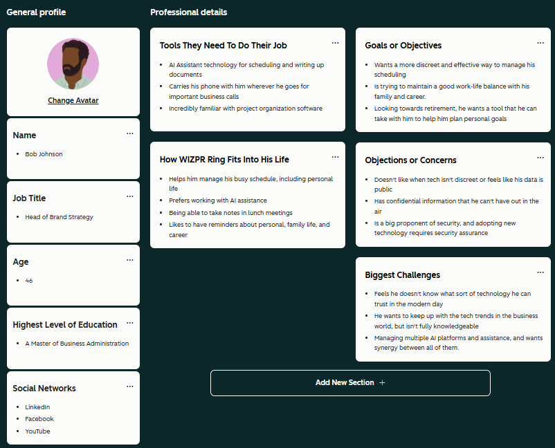
    Primary Audience – Early Adopter Tech Professionals 

    Demographics

    Gender – Male

    Ages – 27-35

    Income – 100k/yr

    Occupation – Working in a tech based industry, likely software engineering or IT

    Location – Lives in a major city or metropolitan area

    Marital Status – Single

    Psychographics

    Values authenticity and personalization

    They choose not to commute by car unless necessary

    Prioritize having an organized lifestyle 

    Likes to be up to date on the latest tech news

    Sees themselves as a tech-savvy person

    Likes digital accessories 

    Believes a good work/life balance is important

    Commonly uses ChatGPT and AI programs in their workflow

    Always look for reviews before purchasing a product

    Trusts the opinion of tech influencers 

    Believes that tech should be synergized and not divided by platforms

    They prioritize functionality over aesthetics

    Pain Points

    They recognize the risks of being an early adopter. They need facts that build trust and authority. They only invest in products that have been supported by other early adopters and have backing from major voices in the tech-sphere.

    They are annoyed that the only AI rings available in the market are fitness-based and not built for professionals.

    Feels they would much rather all of their tech be accessible on one platform rather than having to deal with multiple separate platforms.

    Purchase Motivations

    They are more likely to purchase a product that is endorsed by other early adopters and tech influencers. They respond well to testimonial and review content. They do thorough research to find answers about a product before they decide to invest.

    Before purchasing a new product, they go to their preferred AI tool to determine whether to purchase a product. They also follow tech newsletters that give them information on the latest tech news and products.

    Socials

    TikTok – Their feed consists of tech news and reviews. They are often targeted with ads promoting AI tool websites. They enjoy finding tips to help them with his work flow.

    YouTube – When they are not busy, they enjoy watching long-form video content about gaming and tech news. While they are working, they use the platform to listen to tech industry-related podcasts.

    Reddit – This platform is used for them to find real, authentic and unbiased reviews of a product. They also follow subreddits such as r/technology, r/gadgets and r/newtech to discuss new technologies.

    Summary and Justification

    This audience is a perfect match for a WIZPR launch. They are deeply connected with the tech and business lifestyle, so they prioritize being front and centre on groundbreaking technology while being ahead in their professional career. They have already adopted AI into their workflow and are looking to synergize their work through one platform. They see an ideal future where AI is used as a tool to progress humanity, and because of this, are interested in supporting and investing in new AI tech. Because WIZPR is backed by over 1000 investors worldwide and has won the 2026 CES Innovation Award, this helps build trust with this audience and deals with the primary pain point of assuring that there will be real results. They respond well to objective facts and base their purchase decisions on testimonials and what the product has to offer. 

    Demographically, the target demographics location, income, marital status, age, gender and employment all align with WIZPR as a brand by focusing on tech-loving professionals who have built a life around their careers. At their economic level, they are more concerned with quality over price points. They have established their ground in their professional careers by this age, and because of this, they are seeking to optimize their workflow. Living in a major city, they are proactive and enjoy an urban, bustling aesthetic.

    Psychographically, the target market values authentic branding that feels like a real person’s testimonial mixed with true facts about a product. They are heavily influenced by major tech voices and other early adopters. Their jobs require a heavy amount of organization and time management so they will respond well to the WIZPR’s pitch as an AI assistant at your fingertips. They are constantly following the tech news and trends and are actively engaged in conversations in tech spaces. 

    Social media is their method of finding new technology and investigating. They trust other early adopters’ opinions and pre-launch reviews from tech gurus, and they consume tech and gaming-related content on both TikTok and YouTube. When they are targeted with ads about AI tech that promises them a better or easier way to manage their workflow, they are more likely to watch the ad all the way through. Social media plays a major role in how they make purchasing decisions as they use it to find testimonials, reviews and facts about a product.

    Secondary Audience – Privacy Conscious Professional

    Demographic

    Gender: Skewing Male

    Ages: 45-55

    Career: Corporate Professional

    Income: 150k/yr

    Location: Outside of major cities

    Relationship Status: Married with a family

    Psychographic

    Values his family and his own privacy.

    Runs a very busy schedule and is time-conscious.

    Familiar with voice AI assistance.

    They want to remain discreet in public.

    Likes to have an organized scheduling system,

    Values collecting meeting notes.

    Values on the go workflow.

    Doesn’t use public transit often and chooses to drive.

    Pain Points

    Feels that his current system is unreliable and would prefer a more convenient way to organize and set meetings.

    Does not like how AI tech is not discrete.

    Wants full synergy with his home technology..

    Purchase Motivations

    He often makes purchase decisions when he knows people who have experience with the product that advocate for it. He would watch YouTube videos and reviews to establish trust and would sign up for email newsletters to discover more information about a product.

    Socials

    LinkedIn – Uses the platform for networking and maintaining connections with previous and current business partners. He comments on things he finds interesting and shares with colleagues.

    Facebook – Uses the platform to stay connected with family and friends. This is where he finds privacy to be most valuable. Often sharing his family’s journeys and accomplishments.

    YouTube – Uses YouTube to watch long-form sports content. Searches up any product before he purchases it.

    Summary and Justification

    This audience gravitates towards the privacy element of the WIZPR ring as their high status means they also manage confidential and important information. The ability to control his schedule and manage his workflow is why this secondary audience is important to consider for the WIZPR ring. They refuse to fall behind in the tech world and are always looking for the next way to optimize their process. Just as they view their work as important, they also value convenience and ways to manage their personal life. Planning for important events is an immediate concern of theirs, and they are looking for a tool that helps them synergize all of their personal and professional activities. 

    “Of the executives surveyed, 92 percent say they expect to boost spending on AI in the next 3 years” (Mayer et al., 2025) People in the positions outlined in this target audience are expected to invest in AI, and this is both in their professional life and likely personal life. AI is seen as a way to optimize and make tedious tasks efficient, which is why this audience gravitates towards the WIZPR ring as a way to make scheduling and task management something they have to worry little about.

    “45 – 54 and 55+ year olds resoundingly feel that their personal data is not protected on any platform. This partly explains the reluctance to share data” (McNameeKing, 2025) The research shows people in an older age bracket are still more apprehensive about sharing data as they feel privacy is not a priority. This means for this target audience, WIZPR’s discretion technology will be a main selling point.

    A. Buyer Personas (2X5 =10 marks) 

    Name: Todd Smith

    Job Title: Assistant Software Engineer

    Age: 27

    Highest Level of Education: Bachelor’s in Software Engineering and Computer Science

    Social Networks: TikTok, YouTube, Reddit

    Industry and Interests: Technology

    Tools They Use For Their Job: 

    • Prefers working on his laptop
    • Uses his phone for managing scheduling and communication
    • Project organization software

    How WIZPR Ring Fits Into His Life

    • Hands free on the go convenience
    • Assists with organizing his tasks both professional and personal
    • An easy-to-use AI tool that he can use to blend with his workflow

    Goals or Objectives

    • He aims to become more organized
    • Being ahead of the curve when it comes to tech
    • Wants to integrate tech into his workflow

    Objections and Concerns

    • They take risks by purchasing products early and being technologically ahead of the curve. How can they trust WIZPR?
    • Is WIZPR going to be another fad technology or something worth investing in?
    • Does it help him streamline his workflow?

    Biggest Challenges

    • Feels he is unorganized
    • He finds it hard to keep up with the tech world right now
    • Struggles with a good work-life balance
    • Struggles at managing scheduling and his social life

    Name: Bob Johnson

    Job Title: Head of Brand Strategy

    Age: 46

    Highest Level of Education: A Master of Business Administration

    Social Networks: LinkedIn, Facebook, YouTube

    Tools They Need To Do Their Job: 

    • AI Assistant technology for scheduling and writing up documents
    • Carries his phone with him wherever he goes for important business calls
    • Incredibly familiar with project organization software 

    Goals or Objectives

    • Wants a more discreet and effective way to manage his scheduling
    • Is trying to maintain a good work-life balance with his family and career
    • Looking towards retirement, he wants a tool that he can take with him to help him plan personal goals

    How WIZPR Ring Fits Into His Life:

    • Helps him manage his busy schedule including personal life
    • Prefers working with AI assistance
    • Being able to take notes in lunch meetings
    • Likes to have reminders about personal family life and his career.

    Objections or Concerns

    • Doesn’t like when tech isn’t discreet or feels like his data is public
    • Has confidential information that he can’t have out in the air
    • Is a big proponent of security, and adopting new technology requires security assurance

    Biggest Challenges

    • Feels he doesn’t know what sort of technology he can trust in the modern day
    • He wants to keep up with the tech trends in the business world, but isn’t fully knowledgeable
    • Managing multiple AI platforms and assistance, and wants synergy between all of them.

    B. Audience Insights & Strategy (2×5=10 Marks)

    Key Messaging Themes 

    Convenient Organization: Both audiences are looking fo a way to optimize their work flow and organize their social life. They see the benefit in having an assistant at their finger tip that feels more personal to them. 

    Privacy: WIZPR appeals to the discrete person who is looking to manage ideas, notes, scheduling and more on the go. This reflects our audiences’ need to feel secure and that what they say is private not being aired out in the public.

    Trust Building Facts: WIZPR having over 1000 backers, awards since 2024 and is being developed by ex Samsung engineers. This builds trust with a skeptical early adopter audience  

    Culturally Relevant Not Just a Fad: Promoting WIZPR as a must have asset and changing the work culture landscape.

    Content Strategy Recommendations

    Social Posts to build awareness at the top of the funnel. Demonstrating the product and promoting it as the next step in optimizing their work flow.

    Web Landing Page for those seeking more information and entering the decision making process. Designed to list benefits and address concerns of the target audiences. 


    Blog content providing information on WIZPR, updates on the technology, awards, meet the team content and more. 

    Email newsletter to keep the hype going for the launch of WIZPR and offer more information for potential leads.

    Tutorial videos and informational content regarding the WIZPR technology.

    Recommended Channels For Reaching Each Audience

    Early Adopter Tech Professional:

    Using TikTok and short form content that feels authentic to the viewer. Having the price as a major sales factor being cheaper than the competitors will immediately answer concerns and lower risk as an early adopter. YouTube ads, including podcast sponsorships for retargeting. Reddit banner ads on related subreddits. This would be optimal for retargeting and reaching him multiple times in the consumer journey. On Reddit, we can develop a subreddit dedicated to WIZPR where users can share their experiences with the product.

    Privacy Conscious Professional:

    LinkedIn content both organic and paid, showing off the WIZPR ring in action and promoting it as the new way of organization, will help create intrigue and awareness. Targeted YouTube advertisements and content showing off all of the features and benefits of the product will be helpful at the MOFU stage. Facebook advertisements will help build awareness and can cultivate trust through a Facebook community.

  • Question #3 

    Visit the St. Clair College website. Analyze it strictly from a visual marketing strategy perspective, targeting: 

    Local domestic high school students. 

    You are to provide three strategic visual enhancement recommendations. For each recommendation: 

    a) Clearly identify the issue or missed opportunity (3 x 2 = 6 Marks) 
    The first recommendation is to replace the homepage hero image with something more student-focused. The visual on the homepage is currently an image of the main St. Clair campus, which is great, but something highlighting more of the students would be stronger. If you were a high school student looking into going to St. Cair College, you would want to see an image that is a lot more exciting than just buildings. 

    The second recommendation is to change the “Our Programs” page banner to something less generic. The image is just the St. Clair College logo on a dark green carpet-type texture. This doesn’t visually communicate what information students are going to find on this page, especially because this is a page that a lot of people will be visiting when looking into different programs. 

    The last recommendation is to change the visual appearance of the “Start Here” menu that sits on top of the hero image. It has bold yellow boxes that definitely catch attention, but feel very overwhelming. The issue is that these large boxes cover the hero image that is sitting behind. The layout simply feels cluttered for a hero section and makes it difficult for users to quickly identify the most relevant option. 

    b) Propose a specific visual improvement (3 x 2 = 6 Marks) 
    If we replaced the hero image with a more student-focused visual, like students walking together on campus, with maybe the school mascot would be more engaging to see. This is something that would get a lot more people excited to apply to college when they see people having fun and smiling. The image can still be in the same place behind the “Start Here” content, but just brighter and overall more exciting. 

    Replacing the banner image with a more program-related imagery or even a carousel of images would be a lot more engaging. A rotating carousel of images would be great because it can showcase students in classes doing hands-on work. The program page is very impotant to high school students, so being visually engaging is crucial for encouraging students to apply. 

    If we redesign this section into a horizontal layout to make the image behind more noticeable, and add simple icons to each selection. Having icons and short labels would make it just as effective but more visually engaging. For example, next to “Full-Time Programs,” there could be an icon of a graduating cap. Thus would be more visually appealing to students to find what they’re looking for compared to how it’s set up now.

    c) Explain why it would improve recruitment effectiveness (3 x 2 = 6 Marks)

    This improves recruitment effectiveness because it highlights the St. Clair lifestyle instead of just the campus buildings. This helps students who are looking into applying for college actually picture themselves going there. If this change is made, it could really help with recruitment because it makes St. Clair College more inviting for new students, since they will be applying and getting information through the website. 

    This improves recruitment effectiveness because it can actually showcase the program environments. It will help students understand what they could be doing in a college classroom when they start school being a good motivation to apply. As mentioned before, the program page is very important because this is where students will be making their decisions. Overall, having a strong visual can make recruitment more effective. 

    It helps improve recruitment effectiveness because it has a simpler and structured layout that allows for quick scanning. This is a form of navigation on the site, so having it still be clear is important, but not as bold as it is now. Highlighting these pathways more visually with simple icons next to text will make it more engaging, leading to an increase in enrolment. 

    d) Connect it to student psychology and digital behaviour (3 x 2 = 6 Marks)
    We live in a world where everyone is a fact scroller when consuming content, especially high school students. This is why this image is so important to be engaging because of the goal to always get someone to stop and click. It increases an emotional connection with the user compared to just ewing building when opening the site. 

    High school students who are looking to apply for college need a strong motive to make that decision. They rely a lot on visual content that has true meaning to it, compared to a generic image of the St. Clair logo. As mentioned before, students are quick browsers, meaning that they won’t be looking at anything on the page for long, but if they can stop and get excited about college, that’s the goal. 

    Just like mentioned before, high school students scan content, so having a visual placed there will help make them stop and consume the content displayed. Having a horizontal layout is also a lot more effective with scanning because it aligns with the F pattern. This makes it easier for student to process the information and make their decision on where to navigate next on the site.  

  • Question #2b

    Explain in detail how the image(s) strengthen the post from a digital marketing perspective. 

    You may reference: 

    • Attention economy 

    • Scroll behavior 

    • Visual hierarchy 

    • Brand perception 

    • Trust building 

    • Emotional triggers 

    • Information processing 

    • Conversion influence 

    Be analytical. This is not a design reflection. This is marketing reasoning.

    The use of images in content helps strengthen the post from a digital marketing perspective because a lot of people will prefer to consume visual content. In the attention economy, people scroll very quickly through content, and they don’t have a very long attention span. They make their decisions on what they’re going to click on in seconds. When choosing an engaging image helps capture users’ attention, for example, my images are in a collage, so it immediately helps capture attention through its multi-image style. Having a very clean and structured layout with a cohesive color scheme also plays a huge role. If the images are well thought out, that does reflect the performance of the post. 

    With this cohesive design its clear and easy for the viewer to digest. Instead of requiring the user to read a lot of text, the collage allows them to instantly know what is happening without reading anything. Overall, a format like this helps people process information quickly. Even if they don’t know much about yoga or pilates, they can still get a good idea of what it’s about. Additionally, visual hierarchy plays a key role in getting the viewer’s attention. With the structured collage layout, the users can easily move their eyes across all the images in the way that it’s laid out. They can follow what their journey will be like if they decide to visit Mindful Moving Wellness, from arriving, stretching, moving, and finally recovering. 

    The images also do a great job of building trust with the users. Everything feels very inviting and relaxing, while even the matcha latte at the end reinforces the idea of self-care. The collage takes you on a journey that captures so much emotion and creates a positive mindset for when they visit the studio. Lastly, the visuals also support conversation influence with the storytelling. By showcasing the studio as such a clam and welcoming environment, it helps people vizuale them their. This can lead to a higher chance of them signing up for a class being the overall goal.

  • Question #2a

    Why did you choose the specific image(s)? 

    Your explanation must include: 

    a) Business relevance 

    b) Target audience alignment 

    c) Image intent 

    d) Why this visual works better than alternative visual approaches

    The Images I selected directly reflect what Mindful Moving Wellness offers as a business. The first image is the yoga mat and blocks, which represent a very calm and inviting atmosphere with the neutral color scheme that stays on brand. The next two images highlight what you may be doing in one of the classes, like stretching and then doing movement exercises. The last image in the collage is the matcha drink from the Wellness Bar being one of the highlights of the studio. This ties in with the whole wellness theme because it gives viewers the idea of resting and recharging after a workout with a matcha latte. When all these images are placed together, they give the consumer an idea of what their journey may look like if they visit Mindful Moving Wellness. 

    The images I selected align with my target audience because they are individuals who are interested in wellness and may be just starting their fitness journey. The images get right to what needs to be communicated to the audience, meaning that someone who doesn’t know much about yoga or pilates will still be able to understand what’s happening. With the soft lighting and natural tone in the images feels like a vary wellness focused environment where you can just relax. Additionally, for beginners, it makes the studio feel a lot more approachable and less intimidating compared to traditional gyms. 

    Each image was selected intentionally to represent different stages of the customer journey when visiting Mindful Moving Wellness. It starts with arriving, stretching, moving and then recharging after your workout. The goal was to use very minimal text that works more as labels than an explanation, but still communicates the message to someone who has never taken a yoga and pilates class. 

    The collage format I chose is a lot more effective than a text-based blog post because it is visually able to communicate. A lot of people would much reather what to look at a collage of images than read a lot of copy because I know I would for sure. When choosing an image, it should be able to communicate just as much as text and feel well-aligned to the brand with its cohesive color scheme and layout. I also decided to do a collage, unlike a single image, because I was able to show more of a story than only sharing one experience offered at that studio. Overall, it is much more engaging and easier for people to process compared to something heavy on text, as long as the image or images selected can get a clear message across.

  • Question #2

    This is a multi-part question. Please create a visual post for your blog on a topic specific to your business and answer the questions below. You will create a visual-first blog post for your business website. This involves critical thinking. What is important to your business and visitors? This is not a written article with an image added. This must be: 

    • Image-led 

    • Message-driven 

    • Minimal text 

    • Strategically intentional 

    The image(s) must carry the meaning. You may use: 

    • Photography 

    • Original graphics 

    • Screenshots 

    • Edited visuals 

    • Multi-image carousel format 

    • Before/after comparison 

    • Visual storytelling sequence 

    • Etc.

    The key requirement – If the text was removed, the visual would still communicate the core message. 

    Please pay attention to what was discussed in class. Ensure that you include a link to the blog post in your answer. Do not forget that this needs to be included in your hardcopy. I am marking what you hand in with your hardcopy but also need to see the digital version on your blog. If it is not online for me to view (in addition to the hardcopy), I cannot mark this question. (4 Marks)

    You must: 

    • Include the visual post in your hardcopy. 

    • Publish the post on your blog under a category titled “Assignment 4” 

    • Include the direct URL in your hardcopy 

    • Ensure your blog navigation is working and accessible

    Collage (Images from unsplash)

  • Question #1 

    Visuals are not decoration. They are communication tools. Provide three strategic reasons why visuals are essential to effective web content. 

    For each reason: 

    • Clearly explain the concept 

    • Provide a real-world example (not generic statements) 

    Marks are awarded for depth, not surface-level answers. (6 Marks)


    The first reason is that the visuals help the viewer understand the content better. Not everyone enjoys reading a lot of content; therefore, visuals that relate to the content displayed can help people understand. For example, if I have a section on my website talking about Mat Pilates classes, I would display an image of someone doing an exercise. Now that there’s an image, people can get the visual representation of what i being talked about in the copy.

    The second strategic reason is that it is what truly can capture people’s attention. This also plays into the color scheme that you choose, which represents the brand identity. I know for me that I like visual hevery content and I would last a second on a website with no visuals because there would be nothing much to get my attention. Lastly, visuals help capture emotion and brand identity. For a wellness studio, the colours you want to choose are warm, natural tones like beige or brown. This is what I chose for my website because I captured the brand identity, and I wouldn’t choose any bright colors because it doesn’t match the brand. This claiming color scheme and photo of people doing yoga, maybe even outdoor captures, so much emotion for the viewer. The visuals all work together to communicate relaxation and mindfulness to the viewer, creating emotion and emphasizing the brand’s identity. 

  • Question #4

    4. For question #2, what did you do differently from the original post? Please outline, explain and justify what you changed & why. Essentially, what did you learn from this new topic and what did you change and why. (8 Marks)

    From my original introduction, there are a few things that I had to change. Starting with that very first line of text being the headline. I reviewed my feedback, and I needed to improve my first line to make mre attention grabbing. It definitely needed to have more details to tell the readers what my business is about. Adding in Pilates and Yoga to this headline helps the reader know what to expect before they actually start reading. From what we learned in class about headlines and plain language, this needed to catch attention but also be easy to understand for the reader. The second thing I did differently was refactoring my paragraph into short paragraphs. I’ve learned not to have any large pieces of text because, realistically, no one enjoys reading content like that. This was another point in my feedback to have bold text, short paragraphs and strategic formatting, which I made sure to have in my new post. I accomplish this by first dividing everything I already wrote into sections that re write, including bloated subheadings, and a section with bullet points. The section I have known with bullet points is on what makes the studio special. These points are on the studios offering like the class levels, Mat Pilates, Yoga and the Wellness Bar. This action is made intentionally for people who scan because they break down useful information to get. The last change that I made was when I was writing. I kept in mind Plain English to ensure this whole post is easy for someone who might be completely new to the world of fitness. Overall, I’m happy with how my new introduction post looks now and feel like it follows the F-Pattern and incorporates Plain English.